Our Build Your Own tool allows you to access data from anywhere in Minnesota and customize it for your community.
To get you started, here are four ways to use the tool to get the data you need.
1. Build a profile
You can build a profile across the state by selecting a single geographic area or combining geographies, including:
- Cities
- Counties
- School districts
- Minnesota Initiative Foundation Regions
- Economic Development Regions
- MN House and Senate Districts
- US Congressional Districts
- Zip codes
- Census tracts
The Build Your Own tool combines data for all of the geographic areas you have selected into one data profile.
For example, suppose you work in a nonprofit organization that serves four Minnesota counties: Murray, Nobles, Pipestone, and Rock. A grant application asks for the poverty rate for your entire service area.
Build a profile
Step 1
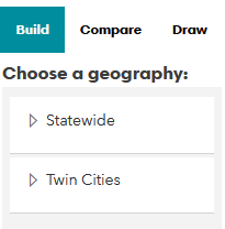
In the Build Your Own tool, select the Build tab at the far right. The statewide map will default to county boundaries, but you can select different map layers under the Statewide and Twin Cities drop-downs.
Step 2
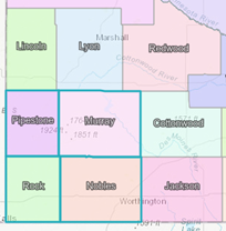
Select all four counties on the map, which will appear in your Selections frame of the tool. You can remove geographies from your selections by clicking on the pink Xs.
Step 3
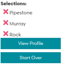
When you are finished making selections, click View Profile to see the data profile for your selected area.
Step 4
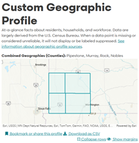
Your custom geographic profile shows that 12% of residents in the service area live below poverty. There are links at the top of the profile to bookmark, share, or download a CSV file of the data.
2. Compare profiles
You can compare profiles for two communities of interest to see how they are similar to and different from one another. The Build Your Own tool will provide a data profile with side-by-side comparisons for your selected communities.
For example, imagine you live in Brainerd and you are lobbying your state legislators on issues related to housing. You can use the compare feature to see how the City of Brainerd differs from Senate District 06 overall on key characteristics like home ownership.
Compare profiles
Step 1
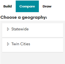
In the Build Your Own tool, select the Compare tab at the far right. The statewide map will default to county boundaries, but you can select different map layers under the Statewide and Twin Cities drop-downs.
Step 2
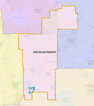
The Cities layer will allow you to find and select Brainerd on the statewide map, which will appear in the Comparison Group 1 frame. Next, select the Comparison Group 2 by clicking the button to the right of it. Switch to the MN Senate Districts layer under the Statewide dropdown to find and select State Senate District 06.
Step 3
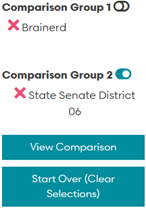
When you are finished making selections, click View Comparison to see the data profile for your selected areas.
Step 4
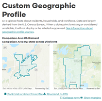
Your custom geographic profile will display two columns of data, one for each comparison geography. This profile shows that 94% of households in Brainerd and 68% of households across Senate District 06 are occupied, likely due to the prevalence of seasonal homes and cabins across the district.
3. Build and compare profiles
You can also use the Build Your Own tool features together to build your own data profile and compare it to another area.
For example, suppose you work for a regional hospital that is working to prevent social isolation among older adults, with locations in Alexandria and Fergus Falls. You are creating your strategic plan and need to know the share of older adults in both cities who live alone, compared to older adults across the entire region. The Build Your Own tool allows you to build a profile that combines Alexandria and Fergus Falls, and then to compare that profile to the West Central Economic Development region.
Build and compare profiles
Step 1
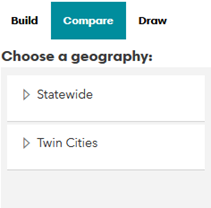
In the Build Your Own tool, select the Compare tab at the far right. The statewide map will default to county boundaries, but you can select different map layers under the Statewide and Twin Cities drop-downs.
Step 2
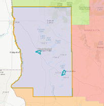
The Cities layer will allow you to find and select Alexandria and Fergus Falls on the statewide map, which will appear in the Comparison Group 1 frame. Next, select the Comparison Group 2 frame. Switch to the Minnesota Initiative Foundation Region layer on the statewide map to find and select West Central.
Step 3
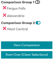
When you are finished making selections, click View Comparison to see the data profile for your selected areas.
Step 4
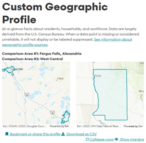
Your custom geographic profile will display two columns of data, one for each comparison geography. This profile shows that a greater share of older adults in Alexandria and Fergus Falls live alone (19%) than in the West Central Economic Development region (14%).
4. Draw a profile
We know that it is challenging for residents throughout the state to get data for areas that do not have pre-defined boundaries, like cities, counties, or regions. With the draw feature and tools, you can select your own area of interest on the map to:
- Plot a point, to plan programming for residents who live within walking distance of a community center or library (for example)
- Draw a polyline, to inform disaster response for populations living near a stretch of flooded river
- Create a polygon (custom shape), rectangle, or circle that match an organization's service area, providing a more nuanced snapshot of residents and their needs
Some St. Louis County residents have remarked, for example, that it can be difficult to access data for more rural communities without including Duluth, a more urban community. The draw feature allows you to draw an area on the map – excluding Duluth – to learn about community needs in northern St. Louis County.
Draw a profile
Step 1
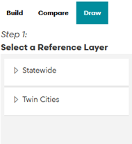
In the Build Your Own tool, select the Draw tab at the far right. The statewide map will default to county boundaries, but you can select different map layers under the Statewide and Twin Cities drop-downs.
Step 2
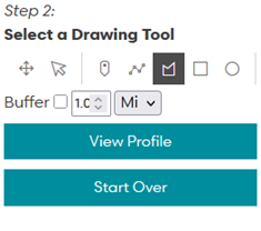
Continue in the frame on the far right to Select a drawing tool, where you can select a tool that will draw your desired shape and a buffer range around your geography (required for points and polylines; optional for polygons, rectangles, and circles).
Step 3
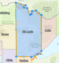
For this example, select the polygon tool to draw your own shape on the map, clicking once to identify the boundaries of the shape and double-clicking when your shape is complete. Then click View Profile to see the data profile for your selected areas.
Step 4
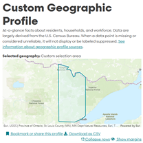
Your custom geographic profile shows unique population characteristics in the northern region of the county.
Got questions? Need additional support?
Get in contact with us and a Compass team member will be in touch.