Some of you know that I taught courses in undergraduate introductory statistics, prior to coming to Wilder Research. My classes were for students who needed a math credit for their degree, but who weren’t necessarily looking forward to a math class and who occasionally brought a fair degree of “math phobia” with them.
I like to think that students left the class with a greater appreciation of statistics, primarily because I didn’t teach it as a math class. Rather, I started with the idea that statistics is a language. Learning a language is challenging, but it allows us to communicate and tell stories…in this case, with data.
So here’s a short primer on telling stories with data on Minnesota Compass. I start with these same questions myself when reviewing and building stories from data on the website.
1. Where are we at?
Start by seeing where things stand. What is the most recent estimate? You’re just looking for one number: a percentage, a median, a number, a count.
Putting it into practice
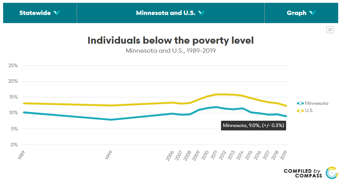
Let’s put this into practice with the Poverty key measure. This chart shows that Minnesota’s poverty rate stands at 9%, with 494,700 living below the poverty threshold in 2019.
On Minnesota Compass, our “top-level” chart will usually have what you’re looking for. For example, our top-level chart in our Poverty key measure shows that Minnesota’s poverty rate stands at 9%. Flip to the Data & notes view using the far right drop-down and we see that 494,700 people lived below poverty in 2019.
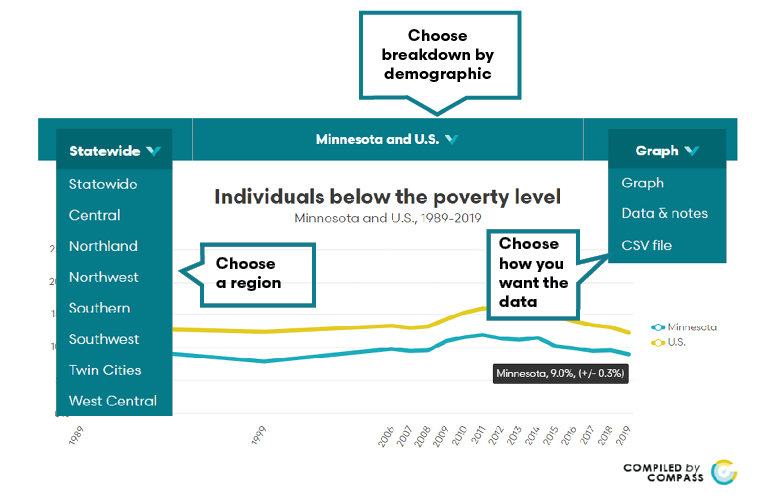
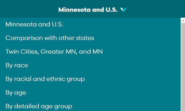
Sometimes you’ll need to dig a little deeper to see where things stand. Are you looking for the poverty rate in Minnesota’s Southwest region? Use the far left drop-down to change geographies. Are you looking for the poverty rate among Minnesota’s older adults? Use the center drop-down to select the “by age” breakdown.
Hot tip
Help translate for your audience. Give them something that helps them understand your “one number.”
- Turn percentages into ratios.
"This means that one in ten Minnesotans live below poverty." - Turn numbers into a more concrete experience.
"That’s enough people to fill Target Field more than 12 times."
"That’s more than the population of Minneapolis, Minnesota’s largest city."
2. How does that compare?
Once you know where things stand, you’ll typically want to know what that means. Comparisons give us a good way to decide where things stand relative to other time periods, places, or populations. You can ask questions like: Are we getting better, worse, or staying the same? Are we better, worse, or the same as other places or populations?
Putting it into practice
A 9% poverty rate is too high when we would certainly like poverty to be 0%, but how does 9% compare to other time periods or places? Looking at this chart, it appears that Minnesota’s poverty rate has been declining since 2014 (getting better). Our poverty rate is three percentage points lower than the national poverty rate (better than the U.S.). Minnesota is home to one of the lowest poverty rates in the nation (better than most other states).
On Minnesota Compass, use the center drop-down to select other breakdowns that will let you see how subgroups fare on this key measure.
Hot tip
- Don’t just eyeball it. Check to make sure you can say things are actually better, worse, or the same. This means checking your comparisons for statistical significance. You’ll need to use the margins of error that appear on most charts and graphs on Minnesota Compass. Just plug your estimates and margins into this handy dandy tool from the U.S. Census Bureau to see whether there is enough evidence to suggest that things are better, worse, or the same. (Psst…we’ve got what we think is a pretty straightforward section explaining margins of error and what they mean.)
3. Where do we see disparities?
Compare your “one number” from the first question to other subgroups. Which subgroups are better or worse than your “one number” on this measure? (Here again…make sure you check for statistical significance.) Differences and disparities could be a part of the story you’re telling. Sometimes, the story is that there are no differences or disparities.
Putting it into practice
As important as it is to see where things stand at a high level, it is equally or more important to see where things stand for smaller populations (subpopulations or subgroups). Minnesota itself is a case study in the importance of digging below the surface on quality of life measurements. At the state level, we commonly perform quite well on quality of life measures, but remain home to some of the largest disparities by race and ethnicity in the nation.
While Minnesota has a poverty rate that is below the national rate and lower than most other states, digging deeper shows us that Minnesota is home to large disparities in poverty by race and ethnicity. In particular, American Indian and Black residents have poverty rates that are three times higher than the state poverty rate (30% and 27%, respectively).
On our website, our top-level chart will usually show a trend line comparison of Minnesota and the United States. You can use this chart to see whether Minnesota is getting better, worse, or staying the same as previous points in time. You can also compare to the national estimate. Hover over the center drop-down to select the “comparison with other states” breakdown to see where we stand relative to other states.
Hot tip
- Try to avoid using “dominant” subgroups as “standard” comparisons. In Minnesota, Black, Indigenous, and populations of color are frequently compared to white residents on quality of life measures – including on Compass charts, reports, and publications. As a start, remember that it is just as easy and compelling to compare subgroups to the overall state average or estimate.
Is that it?
Well, yes and no. This will give you a good start, especially if you are relatively new to storytelling with data.[1] To round things off, I just have a couple more hot tips to make your data stories as interesting and accurate as possible.
A few more hot tips
- Round those numbers. Take away the decimal point or, for numeric estimates, round the number so there is at least one zero at the end. We’re not losing a great deal of clarity or accuracy by saying the national poverty rate is 12% (versus 12.3%), for example. It’s okay to say that, nationwide, more than 39 million people live below poverty (versus 39,490,096). In fact, we’re probably making it easier for our audience to understand. And when there are margins of error around the estimate, we’re typically losing very little accuracy by rounding.
- Try to use “percent change” and “percentage point change” accurately. Minnesota’s poverty rate was 12% in 2011, but stands at 9% today. That’s a 3 percentage point change – not a 3 percent change. A percentage point change is the simple numeric difference between two percentages. There were 622,000 people living below poverty in Minnesota in 2011, compared to 494,700 today. That’s a 20 percent decline in the number of people living below poverty. Percent change describes a rate of change. (You can calculate a percent change between two percentages, but I usually find that confusing and only use percent change for numeric estimates.)
- Have fun! Storytelling – even with data – is fun. Explore the data, be creative, and find ways to engage your audience.
[1] The more data savvy among you may find that this article falls short. Where is the material about sample versus population, measures of variability, and alpha levels? What about issues with repeated statistical testing? I get it…I do. But for the folks who are using this primer, we probably don’t need to get that far into the weeds. Let’s not scare people off. We’re just starting gently here. 😊 You and I can talk statistical inference over coffee.